A project by Saranya Arun Menon, Sohyun Cho, and Tejas Bhuwania (CS-6730, Georgia Tech)
A hate crime is a prejudice-motivated crime which occurs when a perpetrator targets a victim because of his/her race, religion, gender identity, etc. Hate crimes are definitely prohibited by the law but we can still frequently see and witness news regarding hate crimes. The FBI has found traces of what are now called hate crimes as far back as World War I; but following the Civil Rights Act of 1964 our role has actively increased.
The total number of criminal incidents in 2020 represents a 16% increase from 2019 and the highest number of hate crime incidents recorded since 2001, a year that documented 9,730 incidents and a sharp rise in hate crimes directed toward perceived Muslim Americans in the wake of the September 11 attacks.
We explored the hate crime data to find any pattern, relations, or even reasons for hate crimes. We collected FBI data on hate crimes from 2010 to 2019. This dataset contains 14 tables based on the specific thesis for each table, we trimmed and focused on some part of the datasets.
Ruling Party effect on Hate Crimes across the country
Hate crimes have been recorded all over the US with varying bias motivations. To take a deeper look we started off by observing the general trends of hate crimes throughout the different states in the US. The visualization below compares the number of hate crimes vs total number of crimes over the years through a line chart. The gradient from blue to red helps depict the change in the total number of crimes and hate crimes going from democrats to republicans as the ruling party. Furthermore, reference bands for the years with the Trumps campaign to his final election in 2016 have been highlighted to emphasize on the shift in gradient color from blue to red.
One of the most evident takeaways from the plot is the steep increase in hate crime numbers post Trump’s election in 2016. Since 2017, after a huge jump, the hate crime numbers have been on a slow upward incline. However it can also be seen that while hate crime numbers have been moving upwards over the last decade, the total number of crimes in general has been on the decline.
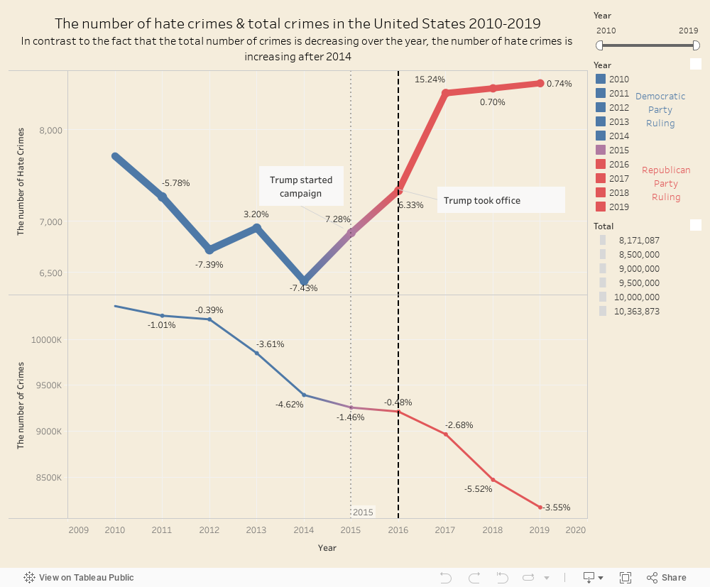
The upper line graph shows trends in hate crime numbers over the years, while the lower line graph shows the trends in total number of crimes over the years. Democrats majority is represented by blue, while Republicans majority is shown as red.
New York to San Francisco : Hate Crime Bias
To hone in on the State-wise data that was generalized in our previous visualization, the below interactive geo plot shows the average number of hate crimes per 100K population for each state for each year. By providing the overview of the map of the United States with equally sized tiles, we hope to provide a more layman perspective into the varying levels across the states. A color gradient has been used to signify the rise or decline in the number of offenses.
The bar chart to the top depicts the number of crimes for different bias motivations, and the bar chart to the right depicts the population coverage for hate crimes in the states. The color gradient within the bars varies with the years. To allow further focusing into the various states, clicking on any state tile will redraw the bar charts to reflect the respective numbers for that particular state.
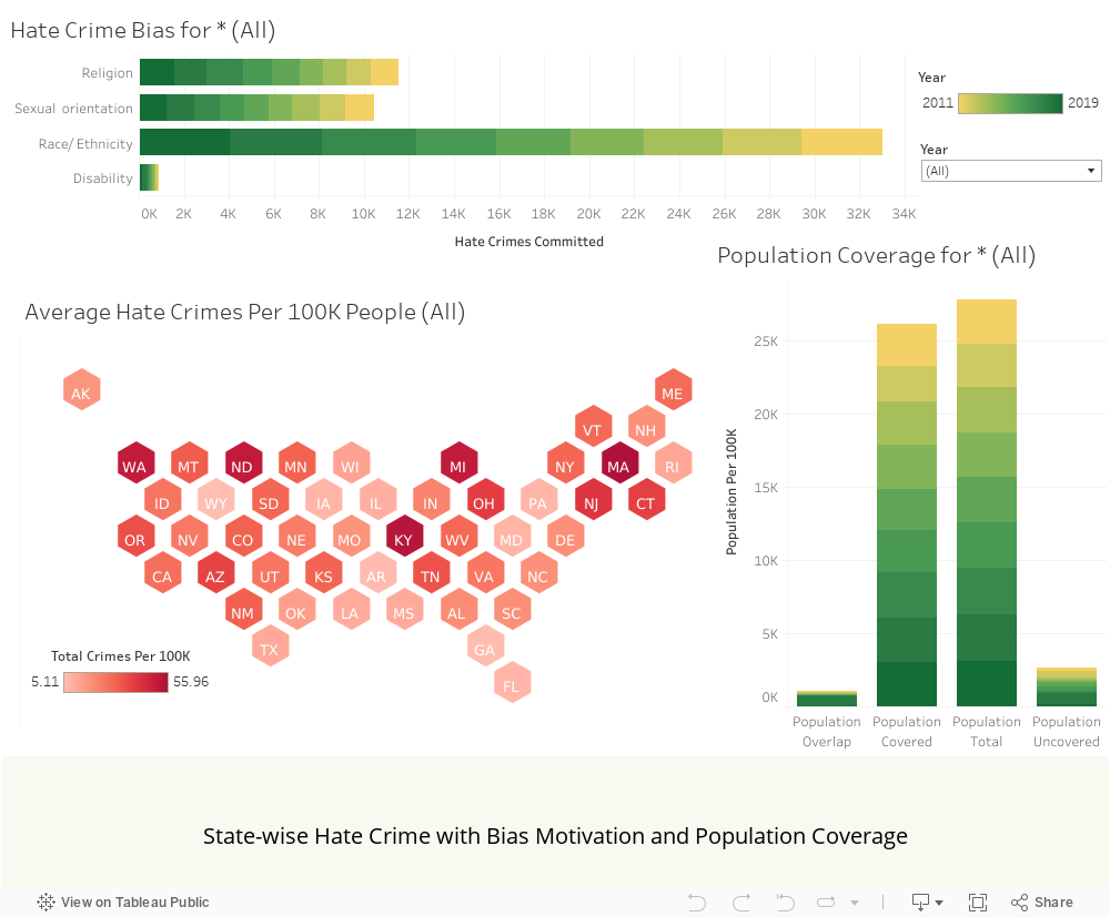
The geoplot at the bottom depicts an overview of the hate crime numbers across the states with variences in the color gradient. Clicking on a state will further focus into the number of hate crimes for different bias motivations in the top bar chart, and the population coverage of the hate crimes in the bar chart to the right. The color gradient within the bars represent the years from 2010-2019
Diversity VS Hate Crime
One particular angle we explored while analyzing hate crime data over the country, was by collecting specific data on the percentage of white and non-white population. The District of Columbia seems to be a major outlier, and hence as been removed to allow for a more relative comparison between the remaining states. An option to include DC has been provided, if interested.
Quite a few insights can be derived from the plot. First of all, most hate crime numbers are clustered towards the lesser proportion of non-white population. Surprisingly most of the top ten states with the highest number of hate crimes and race-based crimes are actually democratic ruled. By the abundance of blue triangles, it is evident the most common type of hate crime is Intimidation. While DC has an exceedingly high number of hate crimes, in its absence Washington takes second spot.
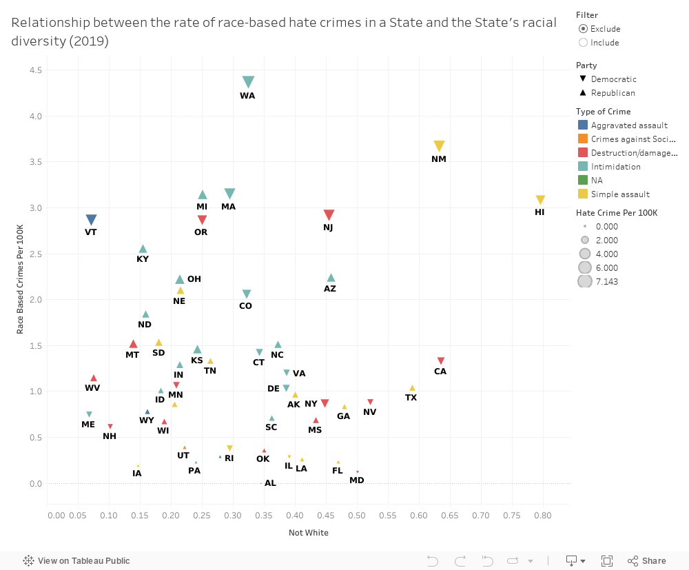
The multi-variate scatterplot above shows the hate crimes numbers across the states based on the proportion of white and non-white population. Size of each point is encoded with the number of hate crimes, while color represents the leading type of crime for that state. Upward facing triangle represents Republican states, and downward facing triangles represent Democratic states. The scatterplot above excludes the District of Columbia as it was a major outlier and hence the other comparisons could not be seen. Do include it using the filter, if you wish to see how it affects the plot.
Focus: Top 3 Bias Motivations
To help put these numbers into perspective over the last decade, we have created the below Circular bar chart, which consists of data across multiple levels. First off, the data is segmented over the years, from 2010-2019. Within each year, the top bias motivators for hate crime have been identified; race, religion and sexual orientation, and have each been assigned base colors. Within these colors, the gradient of each bar segregates the crimes into various types such as aggravated assault, vandalism, intimidation and simple assault. The chart allows for instantaneous understanding of the levels over the years, the subsequent leading motivations, and furthermore which primary type of crime is the culprit for these numbers.
Evidently Race can be seen to constantly be the top motivator for hate crimes over the years with over 1,000 cases being reported per year for specific type of crimes. Since 2016, religious hate crimes have also become comparatively high, while crimes against sexual orientation have been miantained near constant numbers.
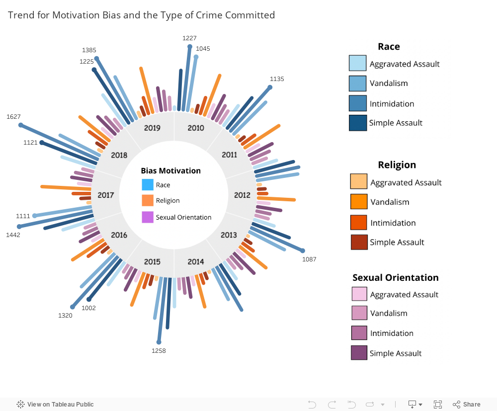
Circular Bar chart that depicts the top 3 bias motivations for hate crimes over the past decade. Each bias motivation is assigned a primary color, and gradient within the colors represent different subtypes of hate crimes
Race, Religion & Hate Crime
We move further into our analysis of hate crime by focusing on crimes motivated by race and religion. Religious hate crimes and non-crime incidents are acts which target a victim because of the offender's hostility towards them or a group based on their faith, or lack of one.
Crimes motivated by inter-faith or intra-faith hostility or a crime targeting someone who has left religion would be investigated and prosecuted as religious hate crimes.
Crimes against race are recorded as the leading motivation for hate crimes in the country. Out of more than 10,800 people who reported that they were the victim of a hate crime last year, 61.9% were targeted because of their race, ethnicity, or ancestry, the FBI reports. Bias against African Americans overwhelmingly comprised the largest category of race-based hate crime incidents, with a total of 56% of race-based hate crimes being motivated by anti-Black bias.
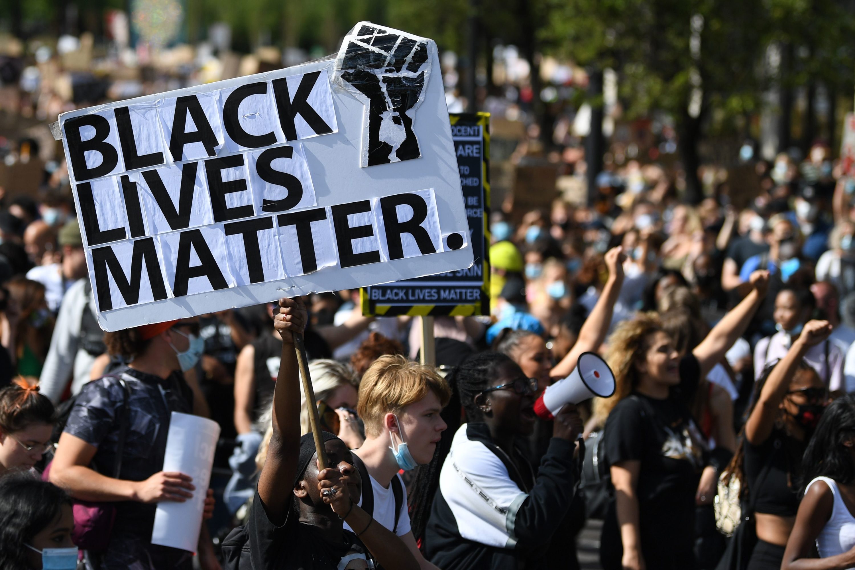
As a result of this continuing trend across the past years, a decentralized political and social movement against incidents of police brutality and all racially motivated violence against black people known as Black Lives Matter has garnered a lot of attention.
After starting in July 2013, this movement returned to the national headlines and gained attention in 2020 following the death of George Floyd. People insist that in the United States, crimes against minorities are still prevalent to convey discrimination and express hate.
Current Affairs show correlation to Religious Hate Crimes
Hate crime originates from prejudice within people, and this prejudice can often be unearthed when certain events or reminders act as triggers. While hate crimes are constantly on the rise for the past decade, we thought it might be interesting to correlate the numbers to national events that could be possible triggers for sudden changes in the levels.
Next we take a closer look at hate crimes against religion. To allow a deeper understanding of the changes in the levels of hate crimes against religion over specific years, we created two stacked area charts to simultaneously provide overview and context of the data, along with a date slider to allow the user to interactively select which year they would like to focus on. The bar chart to the right also provides insight on the number of victims that faced religious hate crimes during that year. In order to provide some background, we have also researched possible national events that took place which could possibly explain any anomalous jumps in the data, and these findings are posted for each year with accompanying images and a brief explanation. While these events may not be directly related to the numbers due to discrepancies in reporting and the extent of hate crimes, we believe they will provide an alternative perspective to the data.
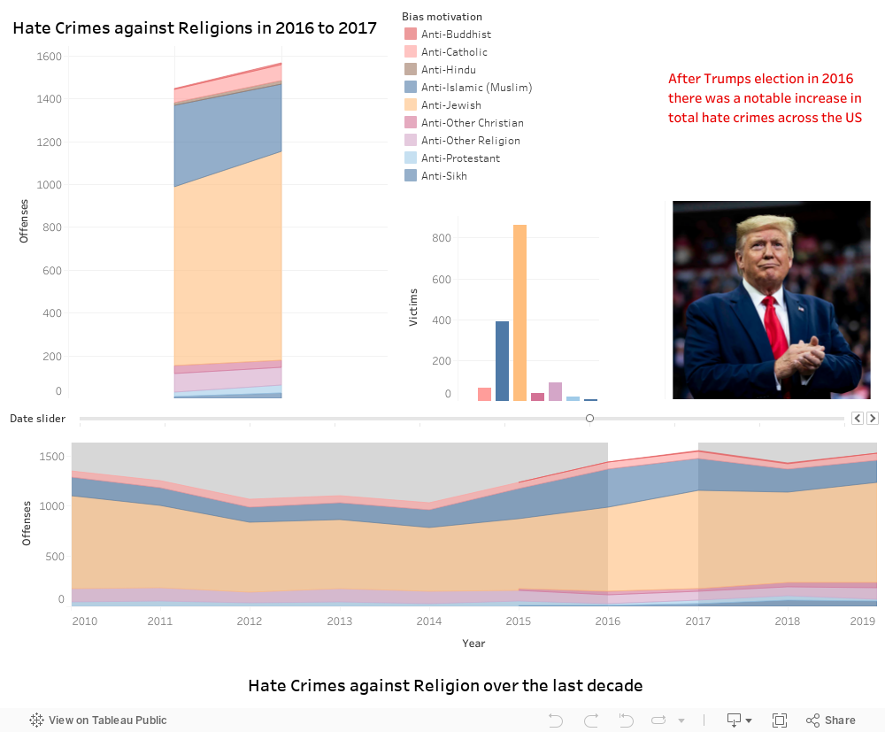
The stacked area chart at the bottom provides an overview on the number of hate crimes against different religions over the past decade. Selection of a year on the date slider will focus the stacked area chart on the top to show the numbers for that year. The bar chart on the top right depicts the number of victims of the religious hate crimes for that year. Furthermore, years with significant changes in the levels have been linked to certain national events, with descriptive images and text.
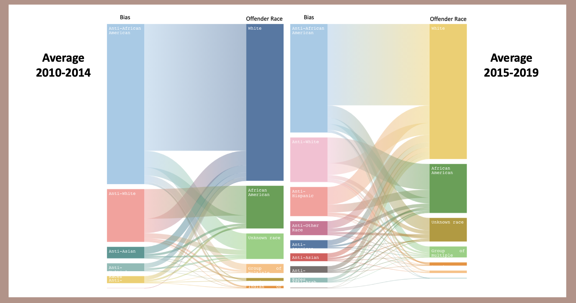
Offender Victim Relationship
Another interesting take away from the FBI database on hate crimes is the relationship between the offenders and respective victims. What kinds of crimes are committed, by offenders of which race/ethnicity, and against victims of which race/ethnicity ? To highlight the relational aspect of this data we have made use of the Sankey diagram, as shown below.
The two Sankey diagrams above show offender victim relationships from 2010-2014 and 2015-2019.
Based on the data, it is evident that in the years prior to 2015 the majority of the hate crimes are committed by white offenders, and mostly against african-american victims. Post 2015, while white offenders and african-american victims are still the most, the victims started to include more numbers from other ethnic groups like hispanic, white, and asian.
Since we saw above that the offender's are largely white, the radial plots have been provided to allow the reader to visualize the year wise data for the races of the victims of the different hate crimes. It can be seen that in the initial years, white offenders’ hate crimes are mostly biased against African Americans. However, as times goes by, not only is the number of hate crimes increasing but it also becomes more widespread to diverse races such as Asian and Hispanic.
Radial plots for the years 2010, 2014, and 2019. The points diverge towards the most affected racial groups for these years in terms of crimes committed by white offenders. See radial plots for all years here.
Where?
Finally, hate crimes can occur at any time, in any place, but it might be useful to know where the chances of being a victim of hate crime are higher, and which locations are safer. On analyzing the database for hate crimes based on religion, we represent the findings below in a radial bar chart that provides the basic overview of the hate crime number across common locations such as streets, home, colleges etc. The top ten locations have been depicted here, with residence/home surprisingly taking the top spot for most number of hate crimes. We hope this representation can help arm people with more information on where such crimes are more likely to occur.
Surprisingly, as seen in the chart, the most common location for hate crimes seems to be within residences and homes, which could lead to mean that hate crimes may usually be instigated with personal bias motivations.
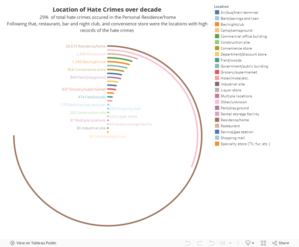
The Radial bar chart above shows the hate crime number based on their location of crime, totalled across the past decade.
Focus : Race & Religion
To understand the huge number of cases that occur in residential homes, we took a closer look at the top motivators; race and religion. Using a dot plot to visualize hate crimes against race over the years, with the locations encoded into the dots, we can see that race based hate crimes mostly occur largely in residential places and homes, providing insight into why number of hate crimes at home are the largest contributors to the levels.
With depressing frequency, we hear about crimes that are apparently motivated by hate against a religious group, and we felt it might be insightful to look into where these incidents occur most often. From the dot plot below, religious hate crimes also seem to occur mostly in residential locations, although other locations like churches were also close in number.
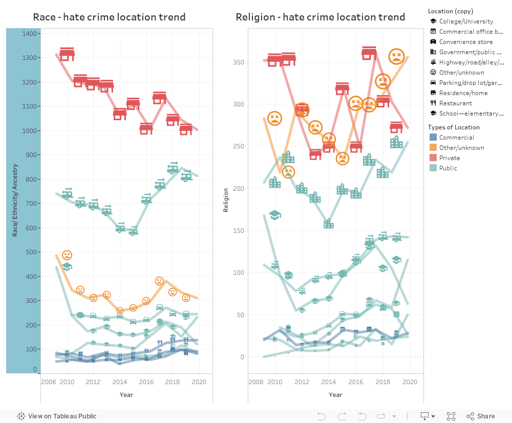
The two line charts depict the trends in hate crime numbers for Race and Religion over the years, categorized by location.
Conclusion
Since 1990, The Hate Crime Statistics Act (HCSA) has required the Justice Department to collect statistics and report annually on hate crimes directed against individuals because of race, religion, ethnicity, sexual orientation, disability, gender or gender identity. Unfortunately, for a variety of reasons, dozens of large cities either do not report hate crime data at all – or under report the data to the FBI. While we our efforts have been to put the recorded data on hate crimes into visual perspective, hate crime and bias incident data released by police departments and federal agencies is just a fraction of actual incidents, and deficiencies in hate-crime reporting have led organizers and activists to take it upon themselves to collect data on their own. Despite this, the definitions of hate crime may differ, leaving policymakers with competing datasets that don't quite capture the scope of the problem.
Bibliography
https://ucr.fbi.gov/hate-crime
https://en.wikipedia.org/wiki/Hate_crime_laws_in_the_United_States
https://www.ojp.gov/files/archives/blogs/2019/addressing-religious-hate-crimes
https://freedomhouse.org/country/united-states/freedom-world/2021
https://www.bbc.com/news/election-us-2016-37945225
https://www.istockphoto.com/photos/crowd-holding-the-american-flag
https://theconversation.com/transgender-hate-crimes-are-on-the-rise-even-in-canada-121541
https://www.wbur.org/hereandnow/2020/06/22/mapping-black-lives-matter-protests
https://atlanta.curbed.com/2019/2/6/18213290/new-initiative-creates-tiny-public-places-atlanta